ClickUp is a project management platform that offers a wide range of features to help organizations manage their work, tasks, communication, and updates. It includes a native employee time tracker, task documentation, real-time status updates, productivity tracking, and integration capabilities.
However, ClickUp’s wide variety of features lead to a number of serious issues. These include a confusing user interface, bugs and glitches, slow automation, and limited layout options. In this article, I explore all these limitations in detail, outlining five reasons why you may want to avoid using ClickUp.
1. Cluttered interface
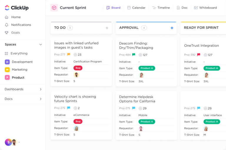
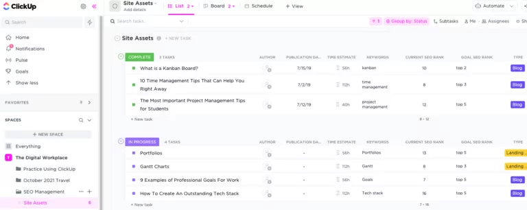
I gotta say, ClickUp’s user interface is quite overwhelming. The platform struggles to present its extensive variety of features in a simple way, which results in a cluttered and crowded interface. A lot of information is presented at once which makes it difficult to focus on the most important tasks or updates.
2. Slow automation
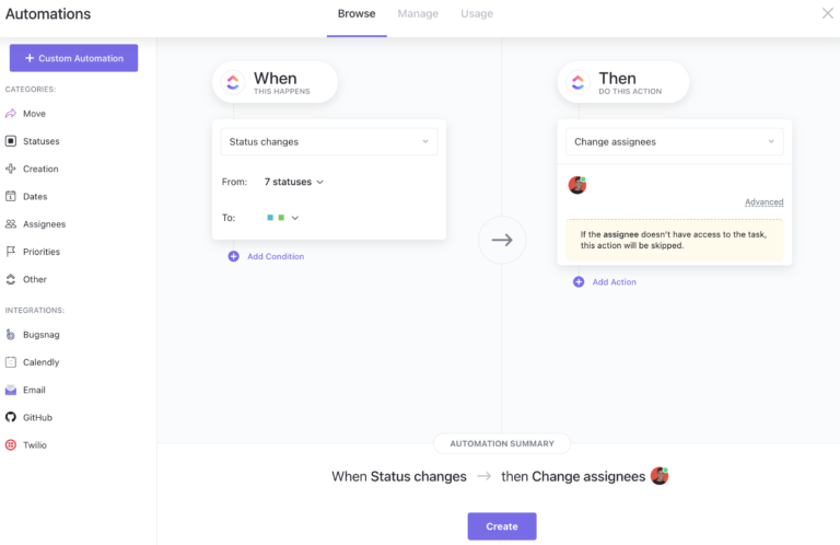
I have found that ClickUp has slow automation, which is annoying when you’re looking to save time on repetitive tasks. Even though ClickUp’s automation features are designed for this purpose, there are several delays in the execution of automation, which leads to delays in workflows.
For example, tasks are not automatically updated or moved to the correct list when they are completed or updated. Moreover, there have been instances where automation triggers have taken longer than expected to activate, which can be frustrating.
3. Steep learning curve
ClickUp’s complicated user interface leads to a difficult onboarding process for employees that are new to the software. I strongly suggest companies to have experienced users navigate through the software first and see if it’s easy to use according to their business’ requirements, because for a new user, there is definitely going to be a steep learning curve that can be daunting.
4. Limited layout flexibility
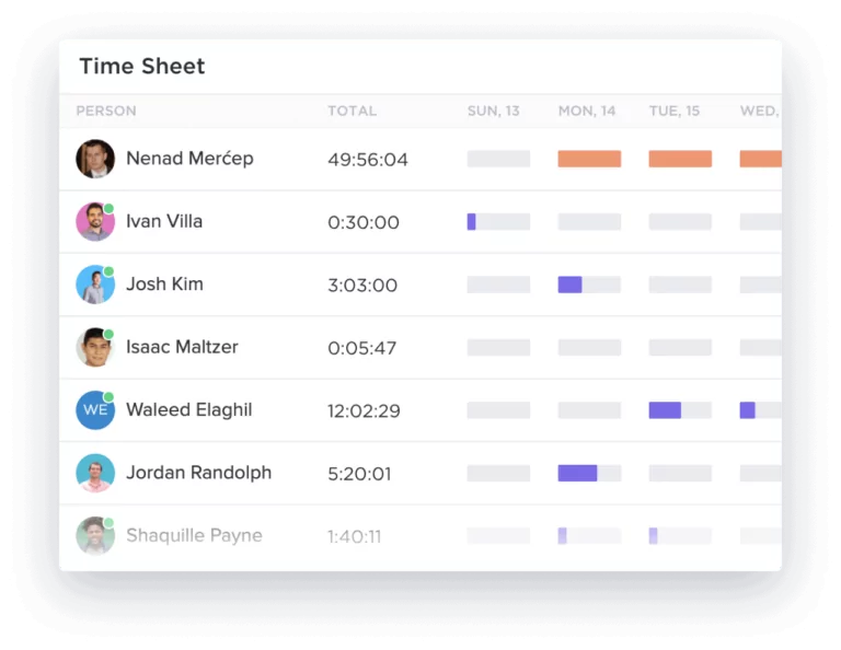
While the platform offers a lot of customizations, I have found the layout options to be limited and inflexible, making it difficult to organize information in a way that works best for a business’ workflow. For instance, the software does not allow users to adjust the size or position of certain elements on the page, such as the task list or the calendar view. This makes it challenging to view all the necessary information at once or to prioritize tasks effectively.
5. Glitches
My main issue with ClickUp is its glitches! These glitches range from minor bugs to major issues causing data loss or corruption. Reported tasks or projects also disappear or are deleted without warning or explanation. There are also issues with the search function and the software unexpectedly freezes and crashes.
Conclusion
It’s apparent that ClickUp has its fair share of drawbacks, and honestly, I would prefer a software with lesser features but a better user experience instead of a tool that offers so many features but struggles with usability. But of course, no time tracking software is perfect, and there are many things to love about ClickUp – which is why it’s such a massively popular choice among businesses. The software’s pricing is also something I’m a fan of.
But before selecting a tool that’s right for you, I suggest you take a look at my verdict on the top time tracking software for 2023 to see which one would suit best for you.
Alternatively, why not read my Honest Review: ClickUp where I give my final verdict on ClickUp.
Don't waste another minute! Jibble is FREE forever.
Get jibbling with the ultimate time tracking software...
Track time now - it's FREE!